
Ant Plus 5, Ant Design Form 简化版,让表单更简单
nanxiaobei · nanxiaobei · 2022-12-06 18:04:13 +08:00 · 2034 次点击这是一个创建于 808 天前的主题,其中的信息可能已经有所发展或是发生改变。

Ant Design Form 简化版,以最简单的方式来搭建表单。
现 Ant Plus 5 发布,重新设计并使用 TypeScript 重写。
GitHub
https://github.com/nanxiaobei/ant-plus
特点
- 告别繁琐的
<Form.Item>与rules - 完整 TypeScript 提示支持
- 轻松拓展已有表单组件
安装
pnpm add antx
# or
yarn add antx
# or
npm i antx
使用
import { Button, Form, Input, Select, WrapperCol } from 'antx';

const App = () => {
  return (
    <Form labelCol={{ span: 8 }} wrapperCol={{ span: 16 }}>
      <Input label="Name" name="name" rules={['required', 'max=10']} />
      <Select
        label="Gender"
        name="gender"
        rules={['required']}
        options={[
          { value: 1, label: 'Male' },
          { value: 2, label: 'Female' },
        ]}
      />
      <InputNumber
        label="Age"
        name="age"
        rules={['required', 'number', 'min=0']}
      />
      <WrapperCol>
        <Button type="primary" htmlType="submit">
          Submit
        </Button>
      </WrapperCol>
    </Form>
  );
};

export default App;
介绍
antx 提供一套 antd 增强表单组件的集合,增强表单组件的特点:
1. 不写 <Form.Item>
直接混写 Form.Item props 与原表单组件 props (完整 TypeScript 提示),显著简化代码。
2. 简化 rules 写法 (仅增强,原 rules 写法同样支持)
提供 string 短语形式 rules ,例如 rules={['required', 'max=10'']} 即 rules={[{ required: true }, { max: 10 }]}。
3. 未新增任何其它 props
所有 props 均为 antd 原有 props ,未新增任何其它 props 及 API ,减少心智负担
此外 antx 还提供了 3 个原始组件(Form、Button、Item),2 个自定义组件(WrapperCol、Watch),以及一个工具函数 create。
API
1. 增强表单组件
一级表单组件:
- AutoComplete
- Cascader
- Checkbox
- DatePicker
- Input
- InputNumber
- Mentions
- Radio
- Rate
- Select
- Slider
- Switch
- TimePicker
- Transfer
- TreeSelect
- Upload
二级表单组件,
antd中使用方式为AAA.BBB,antx中可直接引入BBB:
- CheckboxGroup
Checkbox.Group - DateRange
DatePicker.RangePicker - TextArea
Input.TextArea - Search
Input.Search - Password
Input.Password - RadioGroup
Radio.Group - TimeRange
TimePicker.RangePicker - Dragger
Upload.Dragger
2. 基础组件
Form、Button、Item均为antd原始组件,为方便使用而提供。Watch、WrapperCol为自定义组件。
- Form
- Button
- Item
Form.Item - Watch 用于监听表单字段变化,可实现仅局部 re-render ,更精细、性能更好
// Watch 使用示例
import { Watch } from 'antx';

<Form>
  <Input label="歌曲" name="song" />
  <Watch name="song">
    {(song) => {
      return <div>歌曲:{song}</div>;
    }}
  </Watch>
</Form>;
- WrapperCol 简化布局代码,props 与
Form.Item完全一致,用于 UI 需与输入框对齐的情况
// WrapperCol 使用示例
import { WrapperCol } from 'antx';

<Form>
  <Input label="歌曲" name="song" />
  <WrapperCol>这是一条与输入框对齐的提示</WrapperCol>
</Form>;
3. create 工具函数
- create 将已有表单组件,包装为支持
Form.Itemprops 混写的组件,轻松拓展现有组件
import { create } from 'antx';

// 拓展 (TypeScript 提示支持)
const MyCustomInputPlus = create(MyCustomInput);

<Form>
  <MyCustomInputPlus label="歌曲" name="song" rules={['required']} />
</Form>;
4. 简化版 rules
// 简化版 rules 使用示例

<Form>
  <Input label="歌曲" name="song" rules={['required', 'min=0', 'max=50']} />
</Form>
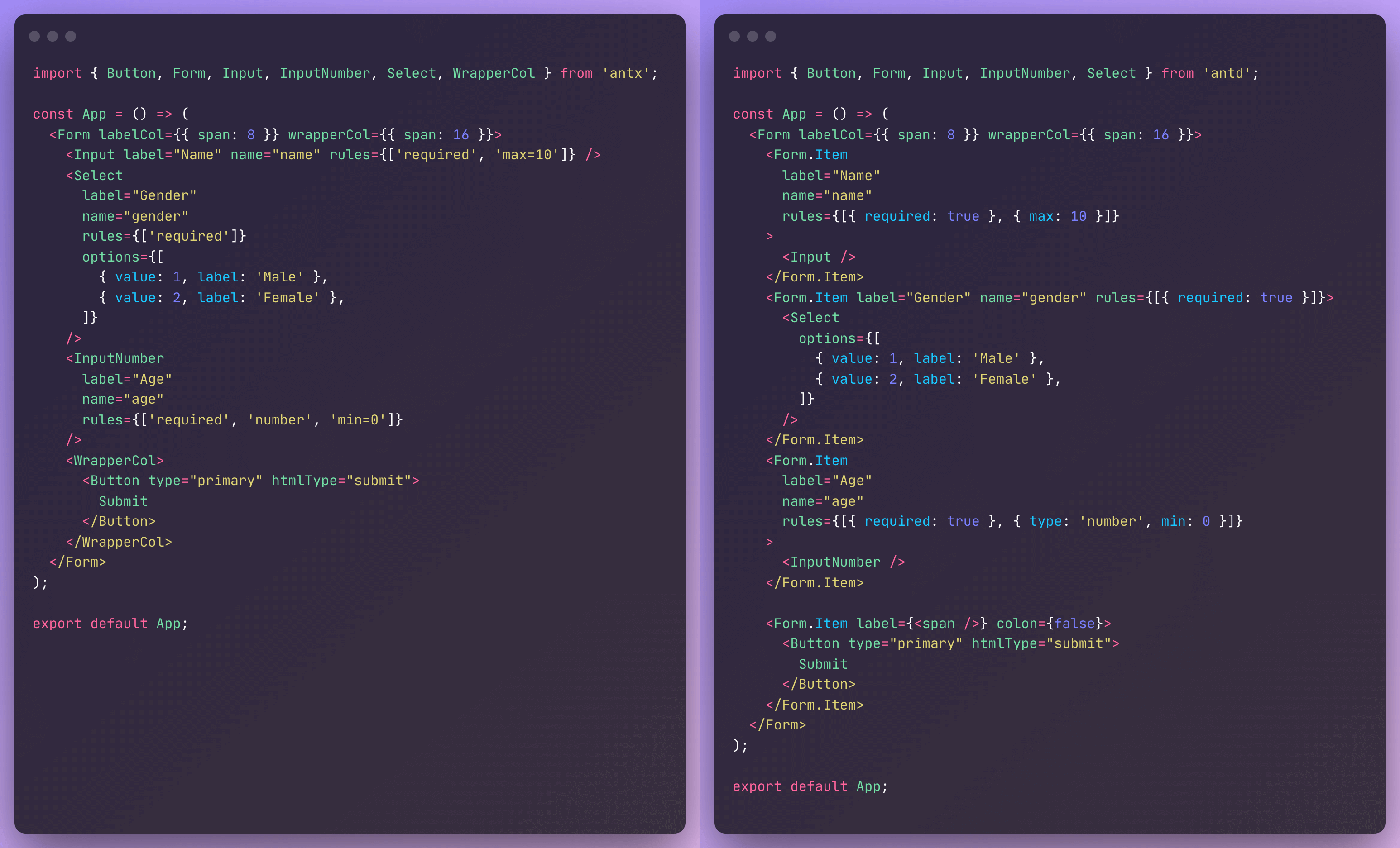
对比
Ant Plus 与 Ant Design 表单代码对比:
试试
1 条回复
 |
1
yolio2003 2022-12-06 23:37:39 +08:00
666
|
 Select Language